Quiet Luxury in UI Design
Why minimalism and high-end typography are replacing heavy shadows and loud gradients in modern digital products.
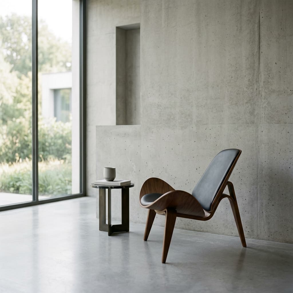
In the world of UI design, we are witnessing a shift. The era of "loud" design—over-saturated gradients, heavy drop shadows, and aggressive call-to-actions—is being replaced by something more refined: Quiet Luxury.
The Power of Restraint
Quiet luxury is about the absence of noise. It's about choosing the perfect typeface, the perfect amount of whitespace, and the perfect weight for a border. It's about design that doesn't scream for attention but commands it through quality.
Typography as Identity
In this design philosophy, typography isn't just about reading; it's about feeling. We use fonts like Lexend for identity and Inter for clarity, creating a contrast that feels modern yet timeless.
Related Resources